Showing posts with label Book Covers. Show all posts

Sunday, September 15, 2024

I Have Ragnar Jónasson Covered!


I've gotten away from cover comparisons the past few months, and since this particular book became my latest addition to my Best Reads of 2024, I thought I'd take a look at the UK and US covers for it...


I think this is the first time that neither cover has really "floated my boat." But, if I had to choose-- and that's what this post is all about-- I'd choose the UK cover. 

As far as I'm concerned, the US cover is bland and would fade right into the background. There's nothing in particular to catch your eye as you're browsing in the library or bookstore. 

On the other hand, the colors on the UK cover help it pop, and the blood-red "carpet" leading to the entrance of the old sanatorium does give it a creepy air. So... I give the UK cover a slight advantage.

What about you? Which cover do you prefer? UK? US? Neither one? Inquiring minds would love to know!

Sunday, August 11, 2024

It's Time for a Cover-Off!


A Faithful Reader brought it to my attention that I hadn't conducted a "Cover-Off" in a long time, so I thought I'd better get in gear. Once again, I'm picking on Michael Connelly. Why? Because he's one of my favorite authors, and since his books are published in so many countries, it's relatively easy to round up a few covers to compare. 

Let's get this show on the road!


Well, what do you think? I find it interesting that the USA/Canada and Australia/New Zealand covers are so similar. A lone figure heading into the surf carrying a surfboard. A dark bank of clouds. And is that the sun going down? Why would someone want to go surfing when the sun's going down? I suppose you could say that it's dawn and not sundown, but when in Los Angeles, you don't head east into the sea.

Even the wording on those two covers is very similar. A slight difference in the sizing and fonts. The placement of the Ballard & Bosch designation changes. And all three chose something a bit different to say about Connelly himself.

On the other hand, the UK/Ireland cover stands out. The surf is rolling up on the beach, and Los Angeles looks like it's baking under a merciless sun. No lone figure with a surfboard. Perhaps the UK publishers didn't want the emphasis to be on Renée Ballard?

Which cover do I prefer? I actually prefer the UK cover. I don't like the misty-looking covers of the USA and Australia. I like the clarity of the UK cover as well as the choice of fonts, their size and placement. For me, there's an air of menace in the UK cover. There's something about the surf rolling up to the blast furnace heat of the city. And the city does seem to be waiting, but waiting for what?

Which cover do you prefer? Inquiring minds would love to know!

Tuesday, April 04, 2023

I Have Ann Cleeves Covered!


It's been awhile since I've conducted a cover-off here at Kittling: Books, and when I stumbled across the US and UK covers for Ann Cleeves' upcoming Matthew Venn mystery, The Raging Storm, I knew it was the perfect opportunity.
 
Let's take a look at the covers. 


Both certainly chose excellent graphics, didn't they? If I were the type of person to get seasick (I'm not), I think I could take one look at either of these covers and feel myself turning unbecoming shades of green. But which one do I like the best?
 
 
The UK Cover
 
In this graphic, I'm at the bottom of a trough, looking up at a small boat at the top. Land is near... but not near enough. Do I need rescuing? Is that small boat my ticket to dry land? There are no definite answers to be found in the graphic, that's for sure. But what about the rest?
 
It's too busy. For one thing, take that badge off the upper left corner. It detracts and distracts even if it does identify the book as a Matthew Venn mystery. Also, you know me and blurbs. Can't stand 'em. Remove "The Sunday Times Bestseller," but if you must have something, keep "One of Britain's best crime writers." I think it would look better if the badge was removed and the Sunday Times line was replaced by something like "a Matthew Venn Investigation."
 
Clean it up. Let the graphic, the title, and the author's name shine!
 
 
The US Cover
 
The US cover makes me feel more like I'm lost in a ferocious storm in a small boat (and probably bailing for all I'm worth). There's no land in view, so no hope for rescue. Those seabirds are looking down on me... probably wondering if I'd make a good lunch.
 
This is a much cleaner cover. In fact, the only thing I'd remove is that "New York Times Bestselling Author" line. This cover does a much better job of giving us an idea of what the book's about as well as telling us who wrote it and what series it belongs to.
 
 
The Verdict
 
Although in many ways, I prefer the graphic the UK cover uses, I have to say that I like the cleaner appearance of the US cover. The important "stuff" is right out there in plain sight, and it's allowed the space it needs to speak to those of us wandering the aisles of our local bookshops and libraries.
 
 
What say all of you? Which cover do you prefer? 

Tuesday, August 23, 2022

I Have Michael Stanley's A Deadly Covenant Covered!


I recently told all of you about Michael Stanley's newest Detective Kubu mystery, A Deadly Covenant, which will be officially released on September 1, so I thought it was time for a Cover-Off.
 
Let's jump right in!


Once again, we have two very different covers, don't we? Normally when this happens, I tend to strongly prefer one cover over the other, but that isn't what happened this time.
 
Both covers have bold colors. Both covers have well-chosen fonts that stand out well against their backgrounds. Neither cover contains a blurb (!), and both have strong graphics that are fully capable of grabbing the attention of any browsing reader in a bookstore or library.
 
So... which one do I choose?
 
I really like the African graphics. They're eye-catching and strong, and it's easy to see from them that the book is a mystery. But, for me, there are so many emotions that come to the surface when I see those two clasped hands on the US cover. Yes, those two clasped hands make quite a statement on the more understated US cover, so... by a gnat's whisker... I choose the US cover as my favorite.
 
What about you? Which cover do you prefer? US? UK? Neither one? Too close to call? Inquiring minds would love to know! 

Tuesday, August 09, 2022

I Have Michael Connelly Covered! (So What Else Is New?)


It's been awhile since I've conducted a cover-off, and since someone on Michael Connelly's team has kindly gathered together book covers for the upcoming Desert Star release, I'm going to pass along my thanks and take advantage.
 
Let's get right down to it!


As far as the US cover goes, I think the author's name and the book title stand out well against the background color. The cover is also clean and relatively uncluttered, which goes to show you that you have to reach the stratosphere of a Stephen King or a Michael Connelly before the marketing teams at the US publishing houses will consider leaving off all the needless quotes.
 
On the other hand, the cover for the UK and Ireland is cluttered with blurbs. You'd think this would be completely unnecessary since Connelly was awarded the Diamond Dagger in 2018 by the UK's Crime Writers Association and was recently honored at the Theakston Old Peculiar Crime Writing Festival in Harrogate.
 
Now we come to my favorite one of the three, the cover for the edition being released in Australia and New Zealand. It's relatively clutter-free, and the author's name and the title stand out well on the darker background. What makes this cover the winner for me is the graphic. There's just something about that dead tree, the sand, and that sun popping up over the mountain that makes you long for air conditioning, a day that convinces you that you're going to sizzle if you walk down the steps into a swimming pool. There's nothing like the desert sun to make you feel as though you're being fried on the hoof. (As you can see, this cover took my imagination on a short flight of fancy.)
 
Which cover do you prefer? They're all very similar, so I think your choice is going to be narrowed down by small details. Which one works the best for you? Inquiring minds would love to know!

Tuesday, March 15, 2022

I Have Sulari Gentill Covered!


Sulari Gentill is one of those authors who's gotten under my skin. She writes the Rowland Sinclair historical series set in Australia. I tried the first in that series, but it failed to grab me; however, Sulari just won't leave me alone. When I watched a virtual event from The Poisoned Pen in which she mentioned she had a standalone book coming out that had a lot to do with The Poisoned Pen's owner, Barbara Peters, that was it. This would be the book that would get me to read Sulari Gentill again.
 
The Woman in the Library is the book, and here is a synopsis of it:
 
"The ornate reading room at the Boston Public Library is quiet, until the tranquility is shattered by a woman's terrified scream. Security guards take charge immediately, instructing everyone inside to stay put until the threat is identified and contained. While they wait for the all-clear, four strangers, who'd happened to sit at the same table, pass the time in conversation and friendships are struck. Each has his or her own reasons for being in the reading room that morning―it just happens that one is a murderer.

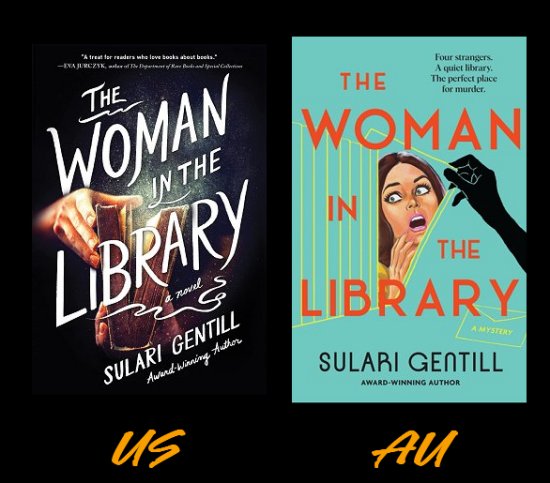
This sounds like something straight out of Agatha Christie, doesn't it? I'll be reading and reviewing it for its June 7 release date, but let's take a look at the covers for its US and Australian editions.


These are definitely two very different approaches to the same book, aren't they?

There's something vaguely sinister about the dark colors, the misty, foggy edges, and the hand reaching for the book on the US cover. Could that be a book of poisons? The white title and the font the publisher has chosen stand out well against the dark background, and there is something about the cover that harks back to an earlier time in publishing.

The Australian edition hails an earlier time in publishing, too. With its bright colors, its damsel-in-distress, and that ominous black-gloved hand, the Australian cover is straight from the 1960s. It even reminds me a bit of the Hitchcock classic, Psycho.

Now... which edition of The Woman in the Library would be more likely to stop me in my tracks and make me pick it up to take a look? I have to admit that the Australian cover is the one for me. I suppose it's that nostalgic '60s vibe that wins me over.

How about you? Which cover do you prefer? US? Australian? Neither one? Too close to call? Inquiring minds would love to know!

Tuesday, March 08, 2022

I Have Chris Hammer Covered!


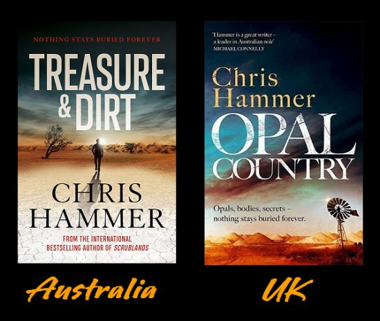
Since I'll be sharing my review of Opal Country tomorrow, I thought I'd do a cover-off of the book. This will be a first because, not only is it a cover-off, it may as well be a title-off as well. Let me show you what I mean.


I've been hankering to read one of Chris Hammer's books for some time, and I have to admit that the title of this one made me grab a UK edition. You see, I love opals, and I knew there were opal mines in Australia. What I didn't expect was the fact that the book was given a different title in the UK. Guess what? I'm glad it was because Treasure and Dirt doesn't do much for me. How do you feel about it? Which title works for you-- Treasure and Dirt or Opal Country? Some part of me does wonder why T&D works better in Australia...

As for the covers, I give the UK edition a narrow lead simply because of the colors. Neither cover really sets my world on fire. The Australian cover does remind me of the main character trying to take one of the walks he prefers and nearly being flattened by the searing heat, but the colors of the sky and the windmill in the UK cover are more eye-catching to me. Between those elements and the title, the UK edition would be the one to make me stop in a bookshop and pick it up.

What about you? Which cover do you prefer? Australian? UK? Too close to call? Or does neither one float your boat? Inquiring minds would love to know!

Tuesday, February 08, 2022

I Have Ann Cleeves Covered (of course...)


Long-time readers of Kittling: Books (bless you!) know that I love all things Ann Cleeves. I even did a fist pump when I learned that she was recently named on the Honors List in the UK "for services to Reading and Libraries" and can now put OBE after her name.

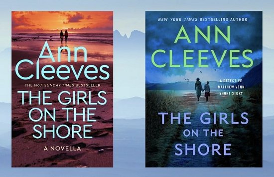
When I came across the UK and US covers for her recent digital short story, The Girls on the Shore, they called out for a Cover-Off. (I'm so predictable!) Let's take a look...


The cover on the left is the UK cover. The cover on the right is the US cover.

Even though my favorite color is blue, I prefer the colors of the UK cover. Does that mean that I prefer the UK cover over all? No, it doesn't. The placement of the author name and title is too big, and the graphic up at the top looks more like one advertising romantic walks along the beach at sunset. 

When all is said and done, I prefer the US cover. I prefer the word placement as well as the graphic-- and those dark clouds provide a chilling bit of menace. Since I've already read the story, I feel that the US cover is truer to it. Now if I hadn't already read the story, would I still prefer the US cover? I don't know... it's a bit of a toss-up because the colors and the graphic of the UK cover keep drawing my eye.

What about you? Which cover do you prefer? US? UK? Too close to call? Does neither one float your boat? Inquiring minds would love to know!

Wednesday, November 24, 2021

Thanksgiving Smiles

On this day when I am so very thankful for all my many blessings (and you're one of them), I thought I would stay on topic with books, but share some book covers that make me smile. I hope they make you smile, too.

Happy Thanksgiving!


I've never ever met a puppy I could resist, and I love these covers to pieces!

Tuesday, November 16, 2021

I Have Martin Walker Covered!


When I told you that Martin Walker's newest short story collection, Bruno's Challenge, was on my radar, I also got a chance to see both the US and UK covers of the book. When that happens, it's usually Cover-Off time, and this is no exception.

Let's take a look...


I guess now is the time to admit that I've never really cared for what the US publisher has done with the covers of Walker's Bruno books, and Bruno's Challenge proves my point. 

What's the deal with the banners? Banners may mean fanfare to someone in the marketing department, but look at how much of the graphic they cover up! And the cover is so dark. I almost get the impression that these short stories are going to be more in the horror genre with all sorts of things going bump in the night in St. Denis. For me, the US cover is most definitely "meh."

Before I say anything about the UK cover, I'd just like to point out that it's apparent that UK readers are much more conversant with France and its regions than American readers. On the US cover, these are "stories of the French countryside," and the series as a whole is known as the Bruno Chief of Police series. In the UK, Bruno's Challenge contains "Dordogne Tales" and the series is known as the Dordogne Mysteries.

The UK cover speaks to me. I like the colors, the font that's used, and the graphic, too. One of the comments on my last cover-off stated that the UK cover was too generic, and I do have to agree. There does seem to be a standard crime fiction cover in the UK. I'm fortunate because I happen to really like that generic template. I suppose I'm one of those readers who doesn't look for ground-breaking artwork on the covers of the books I read.

What about you? In the case of Bruno's Challenge, do you prefer the US cover or the one from the UK? Inquiring minds would love to know!

Tuesday, November 02, 2021

I Have Elly Griffiths Covered!


When I found out about the next book in Elly Griffiths' wonderful Dr. Ruth Galloway series, The Locked Room, I also got a chance to see both the US and UK versions of the book cover. You know what that means: Cover-Off!

Let's take a look, shall we?


Both covers have a similar feel to them, don't they-- a rather isolated-looking house. Both covers are relatively uncluttered, although I do think that the blurb on the UK cover is unnecessary. Both tell us that this is a Dr. Ruth Galloway mystery. Naturally, the US cover has to tell us that Griffiths is an award-winning author because there are readers who won't waste their time on books if the authors haven't won any awards. *sigh* Although... if that gets them to pick up this book and read it, that's a good thing, right?

I don't know if I've mentioned this before, but I've never cared for the font that the US publishers use. For some reason, that particular font makes me think light-hearted and silly, and that isn't a good indication of what the books are like at all.

Now, let's get down to the brass tacks-- the graphics. Both are lonely houses under brooding skies. Which house do I prefer? Most definitely, the UK house. I've been there. I've seen many houses like that. Sturdy stone cottages that will always stand the tests of time and weather. When I look at the house on the UK cover, I want to see what's on the other side of the road. What kind of view does that lonely house have? And why does that house look as though it holds secrets? What happened there? The UK cover engages my imagination and my need to know more. On the other hand, the blue house on the US cover looks like it could be standing above a windy beach on the Outer Banks or Cape Cod, which is good... if the book was set on the Outer Banks or Cape Cod.

So... the UK cover is the hands-down winner of this cover-off. What about you? Which cover do you prefer? US? UK? Neither one? Inquiring minds would love to know!

Sunday, August 15, 2021

I Have Michael Stanley Covered!


When I held a Cover-Off for Emma Stonex's The Lamplighters (a book I just finished, by the way), I received an email pointing me in the direction of two more book covers that couldn't be more different if they tried. I already had Val McDermid lined up, so this newest one had to wait until today.

The writing team known as Michael Stanley (Michael Sears and Stanley Trollip) writes a marvelous police procedural series set in Botswana that features Detective Kubu as well as the landscape, people, and culture of the country. (Don't tell anyone, but I much prefer it to another series that has a main character named Precious...)

The covers I want to take a look at today are for the latest book in the series, Facets of Death. Here's the synopsis of the book, since it can sometimes be helpful to have an idea of what the book is about before you take a look at the covers.

David Bengu has always stood out from the crowd. His personality and his physique match his nickname, Kubu―Setswana for "hippopotamus"―a seemingly docile creature, but one of the deadliest in Africa. His keen mind and famous persistence have seen him rise in the Botswana CID. But how did he get his start?

His resentful new colleagues are suspicious of a detective who has entered the CID straight from university, skipping the usual beat cop phase.

Mining diamonds is a lucrative business, but it soon proves itself deadly. Shortly after Kubu joins the CID, the richest diamond mine in the world is robbed of 100,000 carats of diamonds in transit. The robbery is well-executed and brutal. Police immediately suspect an inside job, but there is no evidence of who it could be.

When the robbers are killed execution-style in South Africa and the diamonds are still missing, the game changes, and suspicion focuses on a witch doctor and his son. Does Kubu have the skill and the integrity to engineer an international trap and catch those responsible, or will the biggest risk of his life end in disaster?

 
Now let's take a look at those covers.


See what I mean about radically different covers?

The UK cover focuses on the witch doctor aspect of the mystery with that bird skull, which is probably some sort of fetish, as well as the chalky white font that's used. Bird skull, title, author. "Detective Kubu's first case may also be his last." That's not bad for a hook to get readers to crack open the book. Two blurbs, top and bottom, by authors better known in the UK than the US (naturally). Even though I don't think they're absolutely necessary, I do think that both blurbs are helpful. Peter James (if you haven't read any of his mysteries, you're missing out) says, "A wonderful, original voice-- McCall Smith with a dark edge and even darker underbelly." While Ragnar Jónasson (if you don't know how I feel about Jónasson, you're a newcomer to the blog, so welcome!) says, "My favorite writing duo since Ellery Queen."

The stark colors used in the UK cover really make it stand out, too.

Now what about the US cover?

It's a lot brighter and a lot busier, that's for certain. It's identified as a Detective Kubu mystery and has the title and author name-- very unlike the normal US cover that tends to rely heavily on blurbs. As I said, the graphics are busy. One part of the graphic layout looks like some sort of textile, and the border resembles a movie theater marquee's lights running around the edge. The central graphic focuses on the diamond heist, with the getaway van speeding away in a cloud of dust. That sun makes sweat pop out on my forehead, and I can almost see giraffes grazing in those trees. 

Now... which cover do I prefer?

I'm leaning toward the UK cover for its stark black and white color scheme and that bird skull that hints of strange goings-on in a culture very different from mine. Yes, the UK cover "speaks" to me more than the US cover. 

But what about you? Which cover do you prefer? US? UK? Too close to call? Or does neither one float your boat? Inquiring minds would love to know! (And if you haven't read this series, it was the very first one I recommended in my post Celebrating Mysteries with a Strong Sense of Place: Africa and Australasia. It's good!)

Sunday, August 08, 2021

I Have Val McDermid Covered!


A couple of weeks ago, faithful reader Kate from North Carolina had an attack of ESP. Either that, or she has a spy cam trained on my blog calendar/planner. I'd stumbled across the two book covers for Emma Stonex's The Lamplighters and within minutes, I walked right into the US and UK covers for Val McDermid's upcoming October release, 1979. You know what that means, don't you? 

Cover-Off! (And Kate knew all about it!)

First, here's the synopsis of the book. Sometimes it helps to have an idea of what a book is about before you take a look at the covers.

It's only January, and the year 1979 has already brought blizzards, strikes, power cuts, and political unrest. For journalist Allie Burns, however, someone else's bad news is the unmistakable sound of opportunity knocking, an opportunity to get away from the "women's stories" her editors at the Scottish daily The Clarion keep assigning her. Striking up an alliance with budding investigative journalist Danny Sullivan, Allie begins covering international tax fraud, then a group of Scottish ultranationalists aiming to cause mayhem ahead of a referendum on breaking away from the United Kingdom. Their stories quickly get attention and create enemies for the two young up-and-comers. As they get closer to the bleeding edge of breaking news, Allie and Danny may find their lives on the line.

The first novel in a brand-new series for McDermid, 1979 is redolent of the thundering presses, hammering typewriters, and wreaths of smoke of the Clarion newsroom. An atmospheric journey into the past with much to say about the present, it is the latest suspenseful, pitch-perfect addition to Val McDermid's crime pantheon.
 
Now that you have a little background, here are the covers--


These two covers are so radically different, you'd never guess that they're for the same book, right? There are elements of both that I like, and other elements that I'm not so sure about. Let's start with the US cover.

Number one, that predominant red color is certain to catch the eye of anyone roaming the stacks of a bookshop or library, and the design is cleancut and simple. Color, one graphic, title, author's name, name of series. But. (You knew that was coming.)

How many bookshop/library stack wanderers are going to know what that graphic is? Is this a subtle hint that this book will only be of interest to folks who actually remember the year 1979? Yes, it does have a lot to do with both the subject and the era, but despite the blazing red color, the major feeling I get when I look at this cover is meh. On to the UK cover.

My first reaction is that I like this cover a lot better, and that the UK publisher put more effort into trying to get this book to sell. An atmospheric graphic. McDermid's name boldly at the top, which makes perfect sense because she's a pillar of the UK crime fiction community. Then the title. Then a blurb. Now... I know I've said in the past that I do not care for blurbs, but I rather like this one. "She's hunting for a story. And someone's hunting her." Creepy. And the UK cover also lets readers know that this is the first book in a new series. 

The only nod to the historical part of the book is the title itself. Even though I do prefer this cover, it does bother me. Why? Because I've seen a lot of UK covers, and this one blends right in with them. It's a bit generic, leaning on McDermid's name and reputation to sell the book. What about possible new readers to whom "Val McDermid" on a cover means nothing? Will they walk past the ordinary-looking cover?

So this Cover-Off is a toss-up. A tie. I have a slight preference for the UK cover, but not enough to declare it the winner.

What about you? Which cover do you prefer? US? UK? Or does neither one float your boat? Inquiring minds would love to know!

Monday, July 26, 2021

I Have Emma Stonex Covered!


It's been a while since I've had a cover-off. Experiencing one distraction after another can do that to a person, so when I came across the UK cover of a book I'd recently downloaded to my Kindle, I thought it was time to dust off this poor, neglected series and start it up again.

What book had I downloaded to my Kindle? Emma Stonex's The Lamplighters because of my weakness for lighthouses, the book's synopsis, and the price. Pardon the digression, but don't you just love when a $14.99 eBook you've been keeping your eye on has its price adjusted to $14.95-- like that four cents is going to make you buy the book? Yeah. Me, too. Needless to say, the sale price for this book involved a lot more than four cents!

But, to get back on track, here's the synopsis of the book:
 

It's New Year's Eve, 1972, when a boat pulls up to the Maiden Rock lighthouse with relief for the keepers. But no one greets them. When the entrance door, locked from the inside, is battered down, rescuers find an empty tower. A table is laid for a meal not eaten. The Principal Keeper's weather log describes a storm raging round the tower, but the skies have been clear all week. And the clocks have all stopped at 8:45.

Two decades later, the wives who were left behind are visited by a writer who is determined to find the truth about the men's disappearance. Moving between the women's stories and the men's last weeks together in the lighthouse, long-held secrets surface and truths twist into lies as we piece together what happened, why, and who to believe.

In her riveting and suspenseful novel, Emma Stonex writes a story of isolation and obsession, of reality and illusion, and of what it takes to keep the light burning when all else is swallowed by dark.


Sounds like the type of story that will make me jump if, while I'm reading it, Denis sneaks up behind me and startles me. Plus, there's the added bonus of the lighthouse being off the coast of Cornwall, England-- one of my favorite spots.

Okay now. Time to take a look at those covers!


To me, both covers are striking and give me the feeling that something is wrong. The abstract graphics and bright colors of the UK cover make me feel as though that lighthouse is in an alternate universe, and that if I go there, strange things are definitely going to happen. Yes indeed, the colors and the graphics used on the UK cover are eye-catching.

However...

(You knew that was coming, didn't you?)

It's the US cover that works for me. It's the US cover that, if I bought books because of their covers alone, would make me buy The Lamplighters. Why? Blue is my favorite color. I love lighthouses, and the one depicted on the US cover makes me feel as though I've climbed all those steps until I'm just below the lantern, and I'm looking out into the darkness and the weather, and I'm looking for... help.

The US cover of The Lamplighters has drawn me right into the story and I haven't even opened the book to read one single word. I have a feeling that that's what the marketing teams for publishing houses want: covers that draw readers right into their books without even opening them. 

What's your opinion? Which cover do you prefer-- UK? US? Neither one? Too close to call? Inquiring minds would love to know!

Wednesday, February 17, 2021

Cover Love: Laurien Berenson


As a rule, I pay very little attention to covers. A cover is not going to make me buy a book. I attribute this to growing up in a library where the books were shelved spine out which made me pay much more attention to titles than artwork. But I do have to admit to a fondness for certain covers. They may not make me buy the book, but I certainly do like to look at them.

This week's case in point is Laurien Berenson's Melanie Travis Canine cozy series. I read a short story in this series and enjoyed it, and I do intend to read further in the series, but as I was taking a look at all the various titles and covers, I noticed that the series has undergone changes through the years. (There are currently over twenty books in the series.)

The covers have gone from cartoonish to what we Americans are used to seeing as a traditional cozy cover to what they are now-- and it's what they are now that puts the smile on my face and the "awwww" in my voice.

If you don't like dogs, you may as well move right along, but if you do like dogs or cute animals in general and feel in need of a good, warm, fuzzy feeling, feast your eyes upon a selection of covers from Berenson's Melanie Travis series. They'll do your heart good.


I don't know about you, but after gazing at all those soulful eyes and furry faces, my batteries are recharged, and I'm ready to go out and fight the good fight. I hope you enjoyed them, too!

Sunday, October 11, 2020

On My Radar: Ragnar Jónasson's The Girl Who Died!


If you've been visiting Kittling: Books for any length of time, you know that I'm a huge fan of Ragnar Jónasson's. I love his Hulda trilogy, which set the timeline of the usual crime fiction series on its head. It's obvious that translating all those Agatha Christie mysteries into Icelandic has taught him how to craft a compelling plot. Yes indeed, any time I learn of a new Ragnar Jónasson mystery, it's a cause for celebration, so let me share what I've found out about his next book-- and there will be an added extra at the end!


Available in US on May 4, 2021!

Synopsis:

"Una is struggling to deal with her father's sudden, tragic suicide. She spends her nights drinking alone in Reykjavik, stricken with thoughts that she might one day follow in his footsteps.

So when she sees an advert seeking a teacher for two girls in the tiny village of Skálar - population of ten - on the storm-battered north coast of the island, she sees it as a chance to escape.

But once she arrives, Una quickly realizes nothing in city life has prepared her for this. The villagers are unfriendly. The weather is bleak. And, from the creaky attic bedroom of the old house where she's living, she's convinced she hears the ghostly sound of singing.

Una worries that she's losing her mind. And then, just before Christmas, there's a murder..."


The Girl Who Died certainly sounds like another atmospheric, claustrophobic story, doesn't it? The book is available in the UK on April 29. Only five days difference between the two release dates means that it will be easier for me to be good and wait for the US release. Besides, there may be a chance of getting an autographed copy from The Poisoned Pen. If you haven't read any of Jónasson's books, I hope you'll give one a try. (Besides his standalones and the Hulda trilogy, he also writes a police procedural series set on the north coast of Iceland.)

And now for the added extra I promised you!

Let's have a Cover-Off!


Hands down, my favorite cover of the two is the US cover. By comparison, the UK cover is absolutely drab and eminently forgettable. What completely floors me is the fact that the US cover has no blurb. None!

But then, who needs a blurb when you've got a gorgeous cover like that? My favorite shades of blue and just the author's name and the book title. The graphic looks like a Pre-Raphaelite painting, and even though it looks as though the woman is drowning (thus giving me the creeps), I want to know what happened to her. And what's up with that key?

Most definitely, if I were in the bookstore, I'd walk right past the UK cover, but the US cover would stop me in my tracks. How about you? Which cover catches your eye? US? UK? Does neither one do the trick for you? Inquiring minds would love to know!

Wednesday, September 02, 2020

I Have Anthony Horowitz Covered!


At the beginning of the month, I told you that Anthony Horowitz's next book was definitely on my radar. Now that I've located the UK cover for Moonflower Murders, I thought it was time for a Cover-Off. 

Let's not waste any time and get right down to it!


Well, with that fire engine red blasting out at us, the US cover certainly grabs the eye, doesn't it? I'm surprised (and pleased) that there are no blurbs to be found, except for telling browsers that the author has been on the New York Times bestseller list. (I must be a rebel because I don't care if the books I read make it to any list or not, although it can be disheartening when authors I love to bits are consistently ignored.)

There has to be some symbolism with the numbered key and all the little doodads hanging down on strings, but the US cover-- to me-- is blah. Or should I have said meh?

On the other hand, the UK cover jumps out at me. My favorite color is blue, and the author's name and the book title stand out clearly. What grabs my attention, however, is the owl-- a noted nocturnal hunter-- swooping in for the kill on a bare-limbed moonlit night. Yes, this cover is the one for me.

Now this little factoid has absolutely nothing to do with my cover preference, but I've always loved the word "moonflower." Somehow, it's magical to me, probably because I once sat outside on warm, full moon nights in my own little moon garden where the predominant color of the flowers was white. How those blossoms glowed in the moonlight! But I digress.

Which cover of Moonflower Murders do you prefer? US? UK? Neither one? Inquiring minds would love to know!

Sunday, May 24, 2020

Stop Petting My Peeves: Son of Book Cover Edition


Remember when I told you one of my prime pet peeves about book cover art? You know, the one where I pitched a fit about saguaros showing up on book covers when the books are set in places where saguaros would never grow?

Well... they're at it again! I don't know how or why this particular book popped up on my screen, but the cover looks like the book is set here in Phoenix. You know I had to take a look. You just knew it, right?


Attention, publishers, marketers, and book cover artistes! You will not find a saguaro in Nevada unless the poor thing is being held hostage. I can't help it if the most iconic cactus in the world is the pickiest when it comes to choosing a place to live.

Now it's time for me to head off into the sunset, grumbling all the way...


Wednesday, February 05, 2020

Stop Petting My Peeves: Book Cover Edition


It's funny how seeing something on the internet gets your mind racing down certain paths. I saw the t-shirt above (minus the phrase "Book Cover Edition") and for some reason, I started thinking of pet peeves concerning books.

Although I have a few pet peeves when it comes to book covers, I'm only going to talk about one. I was reading along quite happily in Lou Berney's excellent November Road when a saguaro was mentioned. I immediately wanted to stop and scratch one of my pet peeves. Why the urge to scratch? Because the characters were in Las Vegas, and saguaros do not grow in Nevada! It's a fact that's easily checked, and in the progression from the writing of a book to its being published, November Road passed by several pairs of eyes. Nobody caught it.

No one caught it with these covers, either.


The Desert Hedge Murders takes place in Nevada, and Holmes on the Range travels quite a bit of the Old West, but the Amlingmeyer brothers don't make it to Arizona either! (I think I've progressed from scratching to grinding my teeth.)

Where you find saguaros.
I know what the problem is. Saguaros have become a symbol of the western part of the United States. But the perfectionist in me just plain flat doesn't like the spread of misinformation. Another example I can think of is Monument Valley. John Ford filmed several Westerns in Monument Valley (which is right on the Arizona-Utah border), and guess where most of those movies were supposed to take place? Texas. Blech.

How many people who read November Road or The Desert Hedge Murders or the Japanese version of Holmes on the Range, visited Nevada, Texas, or who-knows-where and wondered where the saguaros were? How many people who saw those John Ford Westerns went to Texas looking for the Mittens or the Three Sisters? At least I can say one thing about the cover of Patricia Stoltey's mystery: there's not a saguaro to be found on any of its subsequent covers.

Denis & the tallest saguaro we've ever seen.
As you could see by the little map section further up, saguaros are very picky about where they grow. I love them. Their history and the facts about them are fascinating. When I lived in central Illinois and went traveling, heading back east and seeing the Mississippi River always told me I was getting close to home. I've lived in Arizona for a long time now. When I come home from a long journey and see saguaros, I know I am home, and even though they've become a symbol, don't try to sell me a book set in Montana that has a saguaro on the cover. I might just have something pithy to say!

I'll bet all of you have some sort of pet peeve when it comes to book covers. Care to share one?