Tuesday, April 04, 2023
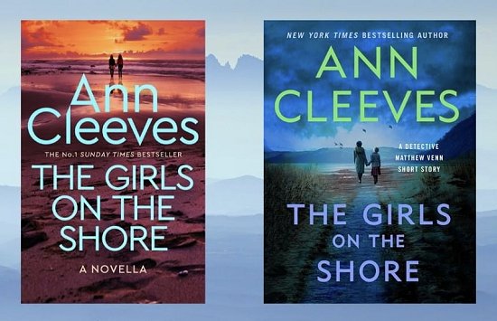
I Have Ann Cleeves Covered!
Tuesday, August 23, 2022
I Have Michael Stanley's A Deadly Covenant Covered!
Tuesday, August 09, 2022
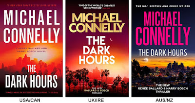
I Have Michael Connelly Covered! (So What Else Is New?)
Tuesday, March 15, 2022
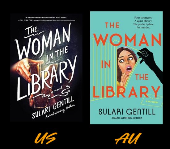
I Have Sulari Gentill Covered!
Tuesday, March 08, 2022
I Have Chris Hammer Covered!
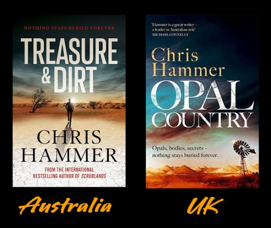
Since I'll be sharing my review of Opal Country tomorrow, I thought I'd do a cover-off of the book. This will be a first because, not only is it a cover-off, it may as well be a title-off as well. Let me show you what I mean.
I've been hankering to read one of Chris Hammer's books for some time, and I have to admit that the title of this one made me grab a UK edition. You see, I love opals, and I knew there were opal mines in Australia. What I didn't expect was the fact that the book was given a different title in the UK. Guess what? I'm glad it was because Treasure and Dirt doesn't do much for me. How do you feel about it? Which title works for you-- Treasure and Dirt or Opal Country? Some part of me does wonder why T&D works better in Australia...
As for the covers, I give the UK edition a narrow lead simply because of the colors. Neither cover really sets my world on fire. The Australian cover does remind me of the main character trying to take one of the walks he prefers and nearly being flattened by the searing heat, but the colors of the sky and the windmill in the UK cover are more eye-catching to me. Between those elements and the title, the UK edition would be the one to make me stop in a bookshop and pick it up.
What about you? Which cover do you prefer? Australian? UK? Too close to call? Or does neither one float your boat? Inquiring minds would love to know!
Tuesday, February 08, 2022
I Have Ann Cleeves Covered (of course...)
Sunday, January 16, 2022
Yet Again, I Have Michael Connelly Covered!
Tuesday, November 16, 2021
I Have Martin Walker Covered!
Tuesday, November 02, 2021
I Have Elly Griffiths Covered!
Sunday, August 15, 2021
I Have Michael Stanley Covered!
David Bengu has always stood out from the crowd. His personality and his physique match his nickname, Kubu―Setswana for "hippopotamus"―a seemingly docile creature, but one of the deadliest in Africa. His keen mind and famous persistence have seen him rise in the Botswana CID. But how did he get his start?
His resentful new colleagues are suspicious of a detective who has entered the CID straight from university, skipping the usual beat cop phase.
Mining diamonds is a lucrative business, but it soon proves itself deadly. Shortly after Kubu joins the CID, the richest diamond mine in the world is robbed of 100,000 carats of diamonds in transit. The robbery is well-executed and brutal. Police immediately suspect an inside job, but there is no evidence of who it could be.
When the robbers are killed execution-style in South Africa and the diamonds are still missing, the game changes, and suspicion focuses on a witch doctor and his son. Does Kubu have the skill and the integrity to engineer an international trap and catch those responsible, or will the biggest risk of his life end in disaster?
Sunday, August 08, 2021
I Have Val McDermid Covered!
It's only January, and the year 1979 has already brought blizzards, strikes, power cuts, and political unrest. For journalist Allie Burns, however, someone else's bad news is the unmistakable sound of opportunity knocking, an opportunity to get away from the "women's stories" her editors at the Scottish daily The Clarion keep assigning her. Striking up an alliance with budding investigative journalist Danny Sullivan, Allie begins covering international tax fraud, then a group of Scottish ultranationalists aiming to cause mayhem ahead of a referendum on breaking away from the United Kingdom. Their stories quickly get attention and create enemies for the two young up-and-comers. As they get closer to the bleeding edge of breaking news, Allie and Danny may find their lives on the line.
The first novel in a brand-new series for McDermid, 1979 is redolent of the thundering presses, hammering typewriters, and wreaths of smoke of the Clarion newsroom. An atmospheric journey into the past with much to say about the present, it is the latest suspenseful, pitch-perfect addition to Val McDermid's crime pantheon.
Monday, July 26, 2021
I Have Emma Stonex Covered!
It's been a while since I've had a cover-off. Experiencing one distraction after another can do that to a person, so when I came across the UK cover of a book I'd recently downloaded to my Kindle, I thought it was time to dust off this poor, neglected series and start it up again.
What book had I downloaded to my Kindle? Emma Stonex's The Lamplighters because of my weakness for lighthouses, the book's synopsis, and the price. Pardon the digression, but don't you just love when a $14.99 eBook you've been keeping your eye on has its price adjusted to $14.95-- like that four cents is going to make you buy the book? Yeah. Me, too. Needless to say, the sale price for this book involved a lot more than four cents!
It's New Year's Eve, 1972, when a boat pulls up to the Maiden Rock lighthouse with relief for the keepers. But no one greets them. When the entrance door, locked from the inside, is battered down, rescuers find an empty tower. A table is laid for a meal not eaten. The Principal Keeper's weather log describes a storm raging round the tower, but the skies have been clear all week. And the clocks have all stopped at 8:45.
Two decades later, the wives who were left behind are visited by a writer who is determined to find the truth about the men's disappearance. Moving between the women's stories and the men's last weeks together in the lighthouse, long-held secrets surface and truths twist into lies as we piece together what happened, why, and who to believe.
In her riveting and suspenseful novel, Emma Stonex writes a story of isolation and obsession, of reality and illusion, and of what it takes to keep the light burning when all else is swallowed by dark.
Sounds like the type of story that will make me jump if, while I'm reading it, Denis sneaks up behind me and startles me. Plus, there's the added bonus of the lighthouse being off the coast of Cornwall, England-- one of my favorite spots.
Okay now. Time to take a look at those covers!
To me, both covers are striking and give me the feeling that something is wrong. The abstract graphics and bright colors of the UK cover make me feel as though that lighthouse is in an alternate universe, and that if I go there, strange things are definitely going to happen. Yes indeed, the colors and the graphics used on the UK cover are eye-catching.
However...
(You knew that was coming, didn't you?)
It's the US cover that works for me. It's the US cover that, if I bought books because of their covers alone, would make me buy The Lamplighters. Why? Blue is my favorite color. I love lighthouses, and the one depicted on the US cover makes me feel as though I've climbed all those steps until I'm just below the lantern, and I'm looking out into the darkness and the weather, and I'm looking for... help.
The US cover of The Lamplighters has drawn me right into the story and I haven't even opened the book to read one single word. I have a feeling that that's what the marketing teams for publishing houses want: covers that draw readers right into their books without even opening them.
What's your opinion? Which cover do you prefer-- UK? US? Neither one? Too close to call? Inquiring minds would love to know!
Sunday, October 11, 2020
On My Radar: Ragnar Jónasson's The Girl Who Died!
If you've been visiting Kittling: Books for any length of time, you know that I'm a huge fan of Ragnar Jónasson's. I love his Hulda trilogy, which set the timeline of the usual crime fiction series on its head. It's obvious that translating all those Agatha Christie mysteries into Icelandic has taught him how to craft a compelling plot. Yes indeed, any time I learn of a new Ragnar Jónasson mystery, it's a cause for celebration, so let me share what I've found out about his next book-- and there will be an added extra at the end!
![]() |
| Available in US on May 4, 2021! |
Synopsis:
"Una is struggling to deal with her father's sudden, tragic suicide. She spends her nights drinking alone in Reykjavik, stricken with thoughts that she might one day follow in his footsteps.
So when she sees an advert seeking a teacher for two girls in the tiny village of Skálar - population of ten - on the storm-battered north coast of the island, she sees it as a chance to escape.
But once she arrives, Una quickly realizes nothing in city life has prepared her for this. The villagers are unfriendly. The weather is bleak. And, from the creaky attic bedroom of the old house where she's living, she's convinced she hears the ghostly sound of singing.
Una worries that she's losing her mind. And then, just before Christmas, there's a murder..."
The Girl Who Died certainly sounds like another atmospheric, claustrophobic story, doesn't it? The book is available in the UK on April 29. Only five days difference between the two release dates means that it will be easier for me to be good and wait for the US release. Besides, there may be a chance of getting an autographed copy from The Poisoned Pen. If you haven't read any of Jónasson's books, I hope you'll give one a try. (Besides his standalones and the Hulda trilogy, he also writes a police procedural series set on the north coast of Iceland.)
And now for the added extra I promised you!
Let's have a Cover-Off!
Hands down, my favorite cover of the two is the US cover. By comparison, the UK cover is absolutely drab and eminently forgettable. What completely floors me is the fact that the US cover has no blurb. None!
But then, who needs a blurb when you've got a gorgeous cover like that? My favorite shades of blue and just the author's name and the book title. The graphic looks like a Pre-Raphaelite painting, and even though it looks as though the woman is drowning (thus giving me the creeps), I want to know what happened to her. And what's up with that key?
Most definitely, if I were in the bookstore, I'd walk right past the UK cover, but the US cover would stop me in my tracks. How about you? Which cover catches your eye? US? UK? Does neither one do the trick for you? Inquiring minds would love to know!
Wednesday, September 16, 2020
I Have Russ Thomas Covered!
October is more like the end of summer here in the Sonoran Desert, but I'm not going to bank on that this year. As I write this on Labor Day, Phoenix has had over FIFTY straight days of temperatures over 110° (that's 43° for you Celsius folks). Combine that with a non-existent monsoon season not providing us with badly needed seasonal rain, and this place is scorching.
What to do...what to do... How about staying inside and comparing the US and UK covers of a book I read a few months ago, Russ Thomas's debut mystery Firewatching? Sounds like a plan, so let's get to it!
Both covers are actually pretty good as far as giving you an idea of what the book might be about. The US cover has a shadowy figure in front of a house, and the flame-colored "specks" make it appear as though sparks are coming from the building. I only have two quibbles with the US cover. One, for cryin' out loud, scrap Lee Child's blurb. From all the covers I've seen, I think he hands his blurbs out like penny candy. Has the man ever read a book he didn't like? (Inquiring minds and all that...) Two, the cover is actually quite bland. Nothing stands out. Nothing really grabs me. I'd probably walk right past it in the bookstore.
As for the UK cover, it has an unnecessary blurb, but since Thomas is a debut author, I'll give that a pass. Interesting that the UK publisher didn't go for someone more famous (like Lee Child). On the whole, though, I like it. It's well-balanced. The red comes right out and grabs your attention. The little paper figures beginning to ignite speak to me-- and they would even if I hadn't already read the book and known that the arsonist/killer has a To Do list.
So it's the UK cover for me, but what about you? Which cover do you prefer? US? UK? Neither one? Inquiring minds just have to know what you think!

Wednesday, September 02, 2020
I Have Anthony Horowitz Covered!
At the beginning of the month, I told you that Anthony Horowitz's next book was definitely on my radar. Now that I've located the UK cover for Moonflower Murders, I thought it was time for a Cover-Off.
Let's not waste any time and get right down to it!
Well, with that fire engine red blasting out at us, the US cover certainly grabs the eye, doesn't it? I'm surprised (and pleased) that there are no blurbs to be found, except for telling browsers that the author has been on the New York Times bestseller list. (I must be a rebel because I don't care if the books I read make it to any list or not, although it can be disheartening when authors I love to bits are consistently ignored.)
There has to be some symbolism with the numbered key and all the little doodads hanging down on strings, but the US cover-- to me-- is blah. Or should I have said meh?
On the other hand, the UK cover jumps out at me. My favorite color is blue, and the author's name and the book title stand out clearly. What grabs my attention, however, is the owl-- a noted nocturnal hunter-- swooping in for the kill on a bare-limbed moonlit night. Yes, this cover is the one for me.
Now this little factoid has absolutely nothing to do with my cover preference, but I've always loved the word "moonflower." Somehow, it's magical to me, probably because I once sat outside on warm, full moon nights in my own little moon garden where the predominant color of the flowers was white. How those blossoms glowed in the moonlight! But I digress.
Which cover of Moonflower Murders do you prefer? US? UK? Neither one? Inquiring minds would love to know!
Sunday, May 24, 2020
I Have Bella Ellis Covered!
It's been a while since I've had a Cover-Off, so I thought I'd better do something about that!
Today I'm comparing the US and UK covers of Bella Ellis's upcoming Brontë Sisters mystery, The Diabolical Bones. (If you want to know what I thought of the first book in the series, The Vanished Bride, you're welcome to take a look.) According to Amazon, The Diabolical Bones will be available in the UK on November 5 and in the US on November 10, but with the publishing industry thrown into a tizzy by the pandemic, I know I'll be doublechecking the dates.
Let's get down to it and see these covers!
My thoughts on the US cover...
I like the colors, but the fonts they use seem a bit wimpy-- and the author's name almost completely disappears in the fog. I like that it proclaims that this is a Brontë Sisters mystery because there have to be plenty of fans (like me) who will see that and have to pick up the book. Holding up a lantern in the fog does give the cover some spooky appeal, but-- is it just me?-- I look at this and am reminded of a Nancy Drew cover. Nancy Drew in hoopskirts? Maybe it's just me! All in all, it's a nice cover, but not particularly striking or memorable. I even find the blurb inoffensive and I normally hate blurbs.
My thoughts on the UK cover...
The color choices are much more classic, and all the print shows up well against the background. I'm fairly certain the building is the Brontë Parsonage in Haworth, and there is a woman standing in front of it with the pages of a book skittering around in the wind.
Perhaps it's the way those tree branches are highlighted, but I find this cover more atmospheric than the US one with its fog. There are no leaves, so it's cold. The wind is blowing. If you have to run through these woods, those branches are going to grab at you, scratch you, lash out at your face, hold you back. As you can see the UK cover gets my imagination going, while the US cover could just be three women looking for a lost dog at night.
Final Verdict...
From what I've already said, it will come as no surprise that I prefer the UK cover. Understated, classic, yet still packs a visual and imaginative punch.
What about you? Which cover do you prefer? US? UK? Too close to call? Don't care for either one? Inquiring minds would love to know!
Wednesday, September 18, 2019
Boy, Have I Got Martin Edwards Covered!
Sometimes, I would love to be the proverbial fly on the wall in publishing houses when decisions are made about which covers to use on books. Sometimes the publishers use the same cover in the US and the UK, but usually, they are different.
What I didn't expect when looking up information on Martin Edwards' newest book Gallows Court (reviewed here on the blog yesterday) were the three chosen covers.
There are three according to Amazon US and Amazon UK. One for the hardcover edition on both sides of the pond, and two different ones for the US and UK paperback editions. Interesting, huh?
I think this calls for a Cover-Off, don't you? Let's take a look!
As you can see, the hardcover and UK paperback editions chose to use Art Deco graphics, which I love and which fit the period in which the book is written.
UK Paperback--
The UK paperback cover is done in cool shades of blue, showing a person standing in the beam of the headlights of an oncoming car. The information-- title, author, and two blurbs-- is very understated. All in all, pretty, but not eye-catching.
US Paperback--
This is a generic disappointment. I've seen so many covers done in much the same style-- usually on books publishers deem to be of interest to women-- that they all blur together. This cover gives a tiny bit of period feel and that's about it.
US & UK Hardcover--
While the UK paperback cover is cool and classic, the cover chosen for the hardcover edition on both sides of the pond retains that period feel and stands out. There's more contrast in the colors chosen, and the slant of the font gives the impression of speed, which is important when a person is shown standing in front of a car. And-- wonder of wonders-- there's no blurb. Be still, my heart!
I think there's no doubt in your minds that I prefer the art for the hardcover edition, but what do you think? Which do you prefer-- UK paperback? US paperback? The hardcover? None of them? Inquiring minds would love to know!
Wednesday, August 21, 2019
I Have John Marrs Covered!
It's been a few months since I've had a Cover-Off, and after reading John Marrs' The Passengers, I thought I'd revive my cover comparison series with this thriller, about driverless cars running amok in England. (You'll be able to read my review of the book next week.)
Let's take a look!
The UK Cover
The simple design and color palette of the UK cover makes the skull-and-crossbones dashboard light pop. "Eight intended victims. Who lives, who dies? You decide." is catchy and does make me want to pick up the book and take a look. Since John Marrs is a UK author, the blurbs about him on this cover don't really mean a thing; however, now that I've read the book, they will help me look up his other books. All in all, this is one very understated cover, and I have to admit that it really doesn't speak to me all that much.
The US Cover
On the other hand, the US cover does speak to me. The catchy "Who lives? Who dies? You decide." is right at the top, and there is the de rigueur blurb, this time from the Los Angeles Times, but it's the graphic that catches my eye. A car traveling at speed... with that one hand showing in the window, desperate to get out. The graphic definitely makes me want to pick up the book.
My Choice
As you can tell by what I said about each one, it's the US cover that wins this Cover-Off. How about you? Which do you prefer-- UK? US? Too close to call? Neither one? Inquiring minds would love to know!
Sunday, March 10, 2019
I Have Clive Cussler Covered!
I used to read Clive Cussler's Dirk Pitt thrillers like they were going out of style, and it all began with Raise the Titanic! Cussler had a knack for choosing bits of history and archaeology that fascinated me, so I read quite a bit before I succumbed to formula-itis and moved on to other books. I still remember the ones I read with fondness, however.
Cussler and his wife are locals here; he's always packed The Poisoned Pen Bookstore for his events, and now the couple has solved the issue of space by holding book launches where fans can enjoy seeing part of their classic car collection. So... I thought it was past time to have Cussler make an appearance on Kittling: Books. Especially when I saw one of the covers. Let's take a look!
The US cover is on one of those taller mass market editions that don't make any sense to me, but that's beside the point. The cover is predominantly GOLD which suits the title, and there's a man looking at Incan figures made of the precious metal. If he wore a fedora, it would be easy to think of him as Indiana Jones. Bright cover, a title that stands out as well as the author's name. It's guaranteed to catch the eye-- especially the eye of Dirk Pitt fans.
Ah, but the UK cover! That wrecked galleon beached on the shore of an island! Both publishing houses have done an excellent job of utilizing elements of the plot in their covers. Neither one of them uses blurbs. It's all down to author, title, story. The basics.
But... I have to admit that I have a thing for those old galleons. I see one of them and I automatically think "treasure," and my imagination begins to race. So the UK cover is my favorite. But what about you? Which one tickles your fancy? Too close to call? Neither one? US? UK? Inquiring minds would love to know!