
Completely by accident a couple of weeks ago, I stumbled across a graphic on Michael Connelly's Facebook page that is tailor-made for a cover-off. With no further ado, let's take a look (with thanks to the graphic's creator):
You can click on the graphic to see it in its original size and in more detail.
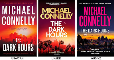
Here we have the covers for Connelly's latest Renée Ballard mystery, The Dark Hours as published in the US and Canada, the UK and Ireland, and in Australia and New Zealand. What surprised me is how similar they all are.
I would imagine all writers dream of the day when their names are larger on their book covers than the titles, don't you? The verbiage is pretty much the same: author's name, book title, identification as a Ballard & Bosch novel, and a blurb telling us what a publishing phenom Connelly is. Only the US cover has to sneak in another blurb about how good the man is. (Overkill, folks!) As far as the fonts and colors used, to my eye, the US choices jump right out at me more than the other two. Do you agree?
The graphics are extremely similar, too. They all show Los Angeles, palm trees, and the sky. The palm trees on the US cover are hidden by the title while they're much more obvious on the UK cover. (Perhaps because palm trees are more exotic and eye-catching there?) The Australia/New Zealand palm trees are very dark and secretive, aren't they? In fact, the Australia/New Zealand cover takes the book title very seriously since it is much darker than the other two. The covers on the US and UK editions show much more intensely colored skylines, and I think these bold colors make the covers more eye-catching.
Now... how would you rate them? Personally, I think the Australia/New Zealand one is the least effective, with the UK cover in the second spot, and the US cover as being the best. Do you agree? Or do you think I've got it all wrong? Inquiring minds would love to know!
I'm with you, Cathy. Usually, I prefer UK covers, but this time, I think the US cover is the most appealing. I would reach for it, anyway. Of course, it's Connelly, so I would even if I didn't like the cover as well...
ReplyDeleteYep. As long as I know it's a Connelly, it could be in a plain brown wrapper for all I care!
DeleteI like the Australian covers and the fact that the title is not in stark white.
ReplyDeleteOne of my friends on Twitter agrees with you, Harvee.
DeleteI'm torn between the UK and the US covers; they're about even in my book. But the Aus/NZ cover is definitely the weakest.
ReplyDeleteYes, those two are very similar.
DeleteInteresting - when voting purely on which cover I like the best I would pick the Australia one. But, when considering which one would be most effective, I would agree that would be the US cover in first place, UK in second and Australia third.
ReplyDeleteThat is interesting!
DeleteI like the dark city image of the AUS cover, but the title font and color from the US version.
ReplyDeleteRemember those Identi-kits they used to show on old crime dramas where you could swap out noses or eyes or chins until you go the right configuration? I think we need one for book covers sometimes.
DeleteU.S. cover no doubt. Like author's name and title big. Of course, as was said, Connelly's books could have black covers with hieroglyphics as the title and I'd read them, especially Ballard and Bosch books.
ReplyDeleteSit down right next to me in this choir, Kathy. *wink*
DeleteAlto or soprano?
ReplyDeleteWell... I used to be a mezzo soprano, but now I'm more of an alto.
Delete