
Sulari Gentill is one of those authors who's gotten under my skin. She writes the Rowland Sinclair historical series set in Australia. I tried the first in that series, but it failed to grab me; however, Sulari just won't leave me alone. When I watched a virtual event from The Poisoned Pen in which she mentioned she had a standalone book coming out that had a lot to do with The Poisoned Pen's owner, Barbara Peters, that was it. This would be the book that would get me to read Sulari Gentill again.
The Woman in the Library is the book, and here is a synopsis of it:
"The ornate reading room at the Boston Public Library is quiet,
until the tranquility is shattered by a woman's terrified scream.
Security guards take charge immediately, instructing everyone inside to
stay put until the threat is identified and contained. While they wait
for the all-clear, four strangers, who'd happened to sit at the same
table, pass the time in conversation and friendships are struck. Each
has his or her own reasons for being in the reading room that morning―it
just happens that one is a murderer."
This sounds like something straight out of Agatha Christie, doesn't it? I'll be reading and reviewing it for its June 7 release date, but let's take a look at the covers for its US and Australian editions.
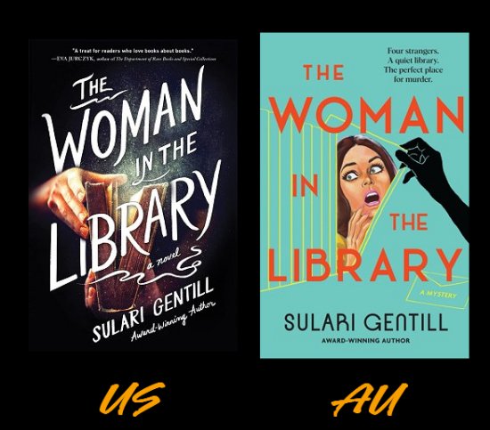
These are definitely two very different approaches to the same book, aren't they?
There's something vaguely sinister about the dark colors, the misty, foggy edges, and the hand reaching for the book on the US cover. Could that be a book of poisons? The white title and the font the publisher has chosen stand out well against the dark background, and there is something about the cover that harks back to an earlier time in publishing.
The Australian edition hails an earlier time in publishing, too. With its bright colors, its damsel-in-distress, and that ominous black-gloved hand, the Australian cover is straight from the 1960s. It even reminds me a bit of the Hitchcock classic, Psycho.
Now... which edition of The Woman in the Library would be more likely to stop me in my tracks and make me pick it up to take a look? I have to admit that the Australian cover is the one for me. I suppose it's that nostalgic '60s vibe that wins me over.
How about you? Which cover do you prefer? US? Australian? Neither one? Too close to call? Inquiring minds would love to know!
I don't like either cover particularly. I'd like the U.S. cover with just the lettering in that eerie font. Wouldn't need the rest of the artwork.
ReplyDeleteThe Australia cover reminds me of a lot of paperback mysteries from decades ago. Lots of them had women screaming, being frightened, etc.
Yes, and most of the women were scantily clad. It's almost as if publishers thought all book covers had to appeal to men. Weird...
DeleteI can see how the Australian cover would get your attention, Cathy, and there is that vibe. But I think the US cover would be my choice. Either way, I'm going to get this book - can't wait to read it!
ReplyDeleteI'm certainly looking forward to it!
DeleteI like both of the covers. Both covers would make me stop to pick up the book. The Australian cover wins by an edge as it has that vintage look. The white text on the U.S. is somewhat overpowering. At first, I had to stop and study to see the book image better but I still like that cover too.
ReplyDeleteYes, the Australian cover has that vintage look without going overboard.
DeleteI do like the vintage look of the Australian cover, but I prefer the US one. Best of all, I really like the sound of the book and will look for it.
ReplyDeleteIt does sound good, doesn't it? :-)
DeleteI like the US cover best. And this book, yes, putting it on my list. I've been to the 'ornate reading room' at the Boston Public Library. That was a fun library to tour. And what does Barbara have to do with this story? Inquiring minds...
ReplyDeleteI do believe she was the inspiration.
DeleteNeither of those covers does much for me, although it does sound like an interesting book.
ReplyDeleteI can see how neither would be appealing.
DeleteNeither cover would attract me parti6, though I think the Aussie version would stand out much more in a display due to those colors.
ReplyDeleteBut I won't hold a cover design against a book, so I'm looking forward to your review - and to learning about the connection to Barbara Peters!
*particularly
DeleteI don't hold a cover against a book either. If I did, there would have been a boatload of books I would not have read in the sixties and seventies due to the scantily clad buxom damsels in distress on the covers.
DeleteI read whatever mysteries were available in my family's house while a teenager. But even then I would not read Mike Hammer/Mickey Spillane books or Ellery Queen's mystery magazine if the covers showed brutality against women. I drew the line at that. And I probably didn't read them if the women on the cover were scantily dressed women in distress.
ReplyDeleteI wouldn't read Spillane either, but that had nothing to do with the covers.
DeleteI didn't know what was inside Spillane's books as I didn't read them, but I suspected mistreatment of women.
DeleteI just don't care for that hard-boiled private eye schtick. Never have. Bores me silly. And as I was working in a library back then, I knew quite a bit about what was inside book covers, whether I read them or not. You have to in order to help patrons.
DeleteI don't like them either, never have. But I knew I wouldn't like them when I saw abuse of women on the covers.
DeleteIt doesn't seem now that such covers as used often. Different images.
Also, I'm reading a book written by a friend who grew up in upstate New York near the sites of abolitionist activity in the 1800s. She wrote a book, "The Third Mrs. Galway," about this period. I'm now reading it. It's good historical fiction. She did a lot of research.
I don't care for either cover at all, BUT I very much enjoyed the book! A unique style of writing.
ReplyDeleteI'm looking forward to reading it.
DeleteI like both, but having read an ARC of the book, I feel like the US cover might be a better match for the tone (at least as I read it). Look forward to the review!
ReplyDeleteI had a sneaking suspicion that the US cover might be truer to the tone of the book.
Delete