
Long-time readers of Kittling: Books (bless you!) know that I love all things Ann Cleeves. I even did a fist pump when I learned that she was recently named on the Honors List in the UK "for services to Reading and Libraries" and can now put OBE after her name.
When I came across the UK and US covers for her recent digital short story, The Girls on the Shore, they called out for a Cover-Off. (I'm so predictable!) Let's take a look...
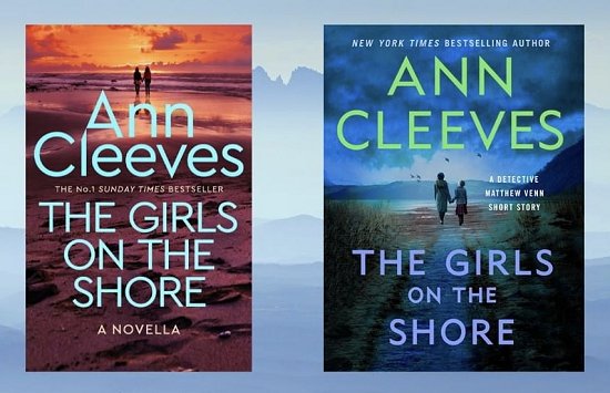
The cover on the left is the UK cover. The cover on the right is the US cover.
Even though my favorite color is blue, I prefer the colors of the UK cover. Does that mean that I prefer the UK cover over all? No, it doesn't. The placement of the author name and title is too big, and the graphic up at the top looks more like one advertising romantic walks along the beach at sunset.
When all is said and done, I prefer the US cover. I prefer the word placement as well as the graphic-- and those dark clouds provide a chilling bit of menace. Since I've already read the story, I feel that the US cover is truer to it. Now if I hadn't already read the story, would I still prefer the US cover? I don't know... it's a bit of a toss-up because the colors and the graphic of the UK cover keep drawing my eye.
What about you? Which cover do you prefer? US? UK? Too close to call? Does neither one float your boat? Inquiring minds would love to know!
The UK cover has a softer, almost romantic feel. The US cover reads more as suspense, I don’t like the green text though. A draw I think
ReplyDeleteYes, I had a hard time making my mind up about this one.
DeleteU.S. covers. I like the blue and the mood and the shore meeting the water.
ReplyDeleteOnly thing which is nitpicking is I think there is a wee bit too much writing on the cover in addition to the author's name and title. Does it need to say New York Times bestselling author? I guess it has to say it's a detective ... short story, although I wish that was shorter somehow. I like the author's name and title basicallly and the design.
You know how I feel about those "NYT bestselling author" bits. Totally unnecessary... except there are many readers who only want to read books written by "winners." *sigh*
DeleteI'm with you, Cathy. I really think the US cover is the better one. I conveys atmosphere and moodiness, at least to me.
ReplyDeleteWell, our eyes are attuned on this one, Margot. ;-)
DeleteI like the U.S. cover better. The U.K. has too writing on it and it covers up the scenic portion. The writing on the U.S. cover separates in the middle highlighting the walkers on the beach. Now I have to go to Amazon and look this one up.
ReplyDeleteIt's as if the graphic doesn't mean beans to the UK publisher.
DeleteContrarian me, I prefer the UK cover. It just seems more Cleeves-ish somehow.
ReplyDeleteHaving more than a bit of the contrarian in me, I applaud your opinion, Dorothy. ;-)
DeleteAnother vote for the US cover here. The picture is more obviously girls, to go with the title, and the colors more in keeping with a mystery. The colors of the UK cover would need a more menacing picture to shift it away from the romance ambiance it currently evokes.
ReplyDeleteThe figures on the UK cover could easily be a man and a woman instead of the two girls they are supposed to be.
Delete